Journey Customization
Journey Customization lets you apply your brand's visual identity to the Unico identity verification journey — with no support ticket, no dependency on the support team, and the result visible right away.
You set the logo, background color, button colors and shape, and content color. Once published, the configuration takes effect immediately for the next journeys started on your branch.
Who it's for: customers using the Web Journey with the iFrame, Redirect, or SDK integration models.
What changes for the end user: the screen they see during identity verification now looks like your brand.
Where to find it: IDCloud Portal → sidebar Settings → Customization tab.
Before you start
Access permission
Your user needs access to the Settings area of the IDCloud Portal. If the gear icon doesn't show up in the sidebar, ask your account administrator to grant access.
How the configuration is applied
| Scope | The customization applies per branch and per integration model. iFrame and Redirect/SDK have independent configurations — publishing one doesn't affect the other. |
| When it takes effect | Immediately after publishing, for journeys started from that moment on. Journeys already in progress keep the previous look. |
| If you don't customize | The journey loads the default Unico theme. |
| Journey version | The preview is based on the Web Journey v3.0 design. On other versions the preview may not accurately reflect the result — in that case, contact Unico about updating your version. |
What to have ready
- Logo in PNG, ideally with a transparent background, up to 60 px tall and 100 KB.
- The hex codes of your brand colors (e.g.
#1B3FA0).
What's configurable in your integration
Besides the integration model, what shows up on screen depends on the Web Journey version of your integration. This is the most common cause of "I don't see this field":
| Feature | 1.0 iFrame | 2.0 iFrame | 3.0 iFrame | 1.0 redirect | 2.0 redirect | 3.0 redirect |
|---|---|---|---|---|---|---|
| Logo | ✅ | doesn't exist | doesn't exist | ✅ | ✅ | ✅ |
| Background color | — | — | — | — | — | ✅ |
| Button background color | ✅ | ✅ | ✅ | ✅ | ✅ | ✅ |
| Button text color | ✅ | ✅ | ✅ | ✅ | ✅ | ✅ |
| Button border radius | ✅ | ✅ | ✅ | ✅ | ✅ | ✅ |
| Content color | ✅ | ✅ | ✅ | ✅ | ✅ | ✅ |
In short: background color is only configurable on Web Journey v3.0 in redirect, and in iFrame the logo only exists on Web Journey v1.0. Colors and button shape work across every combination.
If you don't know which version you're on, check with your Onboarding contact or Unico support.
Step by step
Step 1 — Open the Customization tab
In the IDCloud Portal, click the gear icon (Settings) in the sidebar. The screen opens directly on the Customization tab.
The Settings screen has three tabs — Customization, Webhook, and QR Code. This guide covers the first one.
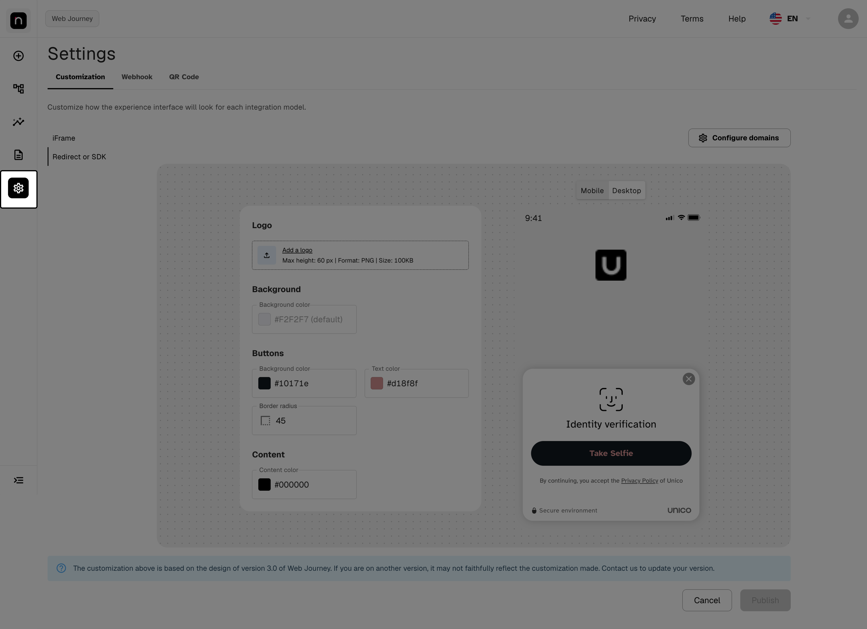
Settings screen with the Customization tab selected.
Step 2 — Choose the integration model
In the left column, select iFrame or Redirect or SDK — the form fields change depending on the model.
You'll recognize the screen in three areas: the model selector on the left, the form in the center, and the live preview on the right, which reacts to every change before you publish.
If you use both models, you need to configure both. They're independent configurations — adjust and publish one, then repeat for the other.
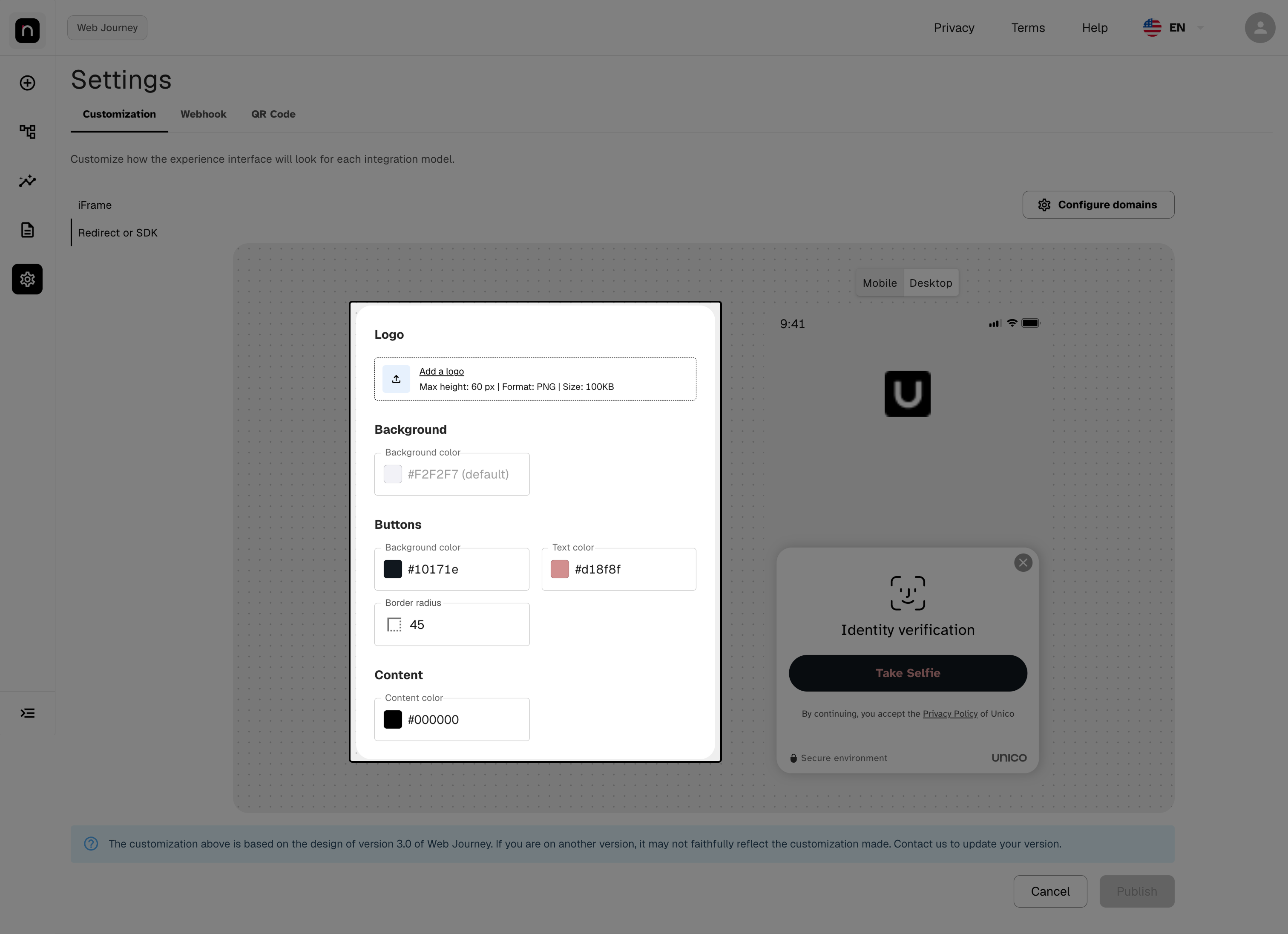
iFrame / Redirect or SDK selector, form, and preview.
Step 3 — Upload the logo
Available in Redirect or SDK. In iFrame, only on Web Journey v1.0.
Click Add a logo and select the file. Requirements: PNG, max height 60 px, max size 100 KB.
Use a PNG with a transparent background. That way the logo works over any background color — a PNG with a white background becomes a visible rectangle once the background is colored. Also prefer the horizontal version of the logo: the available space is wide and short.
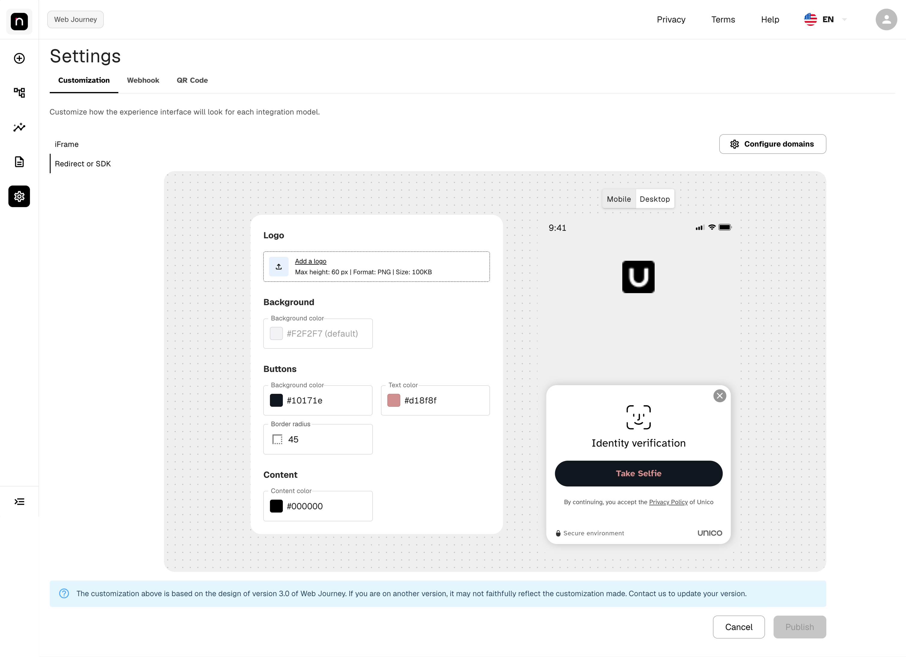
"Add a logo" field with the format, height, and size requirements.
Step 4 — Set the colors
There are four color fields, grouped in the form under Background, Buttons, and Content:
| Field | Where it appears in the journey | Default | Availability |
|---|---|---|---|
| Background color | Background of the journey screen | #F2F2F7 | Web Journey v3.0 in redirect only |
| Buttons → Background color | Fill of the action button (e.g. "Take Selfie") | — | All versions |
| Buttons → Text color | Text inside the button | — | All versions |
| Content color | Titles and descriptions (e.g. "Identity verification") | #000000 | All versions |
For any of them, you can type the hex value (e.g. #1B3FA0) or click the color swatch to
the left of the field to open the visual picker. In the background and content fields, as long as
you leave them empty, the journey uses the default value shown as a placeholder in the field
itself.
Background color is applied as a gradient, not a solid color. The tone you set is the top of the gradient, and the journey darkens progressively toward the bottom of the screen. Very dark tones result in an almost-black base — choose a medium-to-light tone if you want a uniform result.
Use your brand's primary color for the button background. It's the element the user needs to find first; if it doesn't stand out, the journey loses conversion.
Choose the four colors as a set, not one at a time. They affect each other: a dark background with black content color makes the journey unreadable, and a light button on a white card can simply disappear. Set all four, and only then check the result in the preview (Step 6).
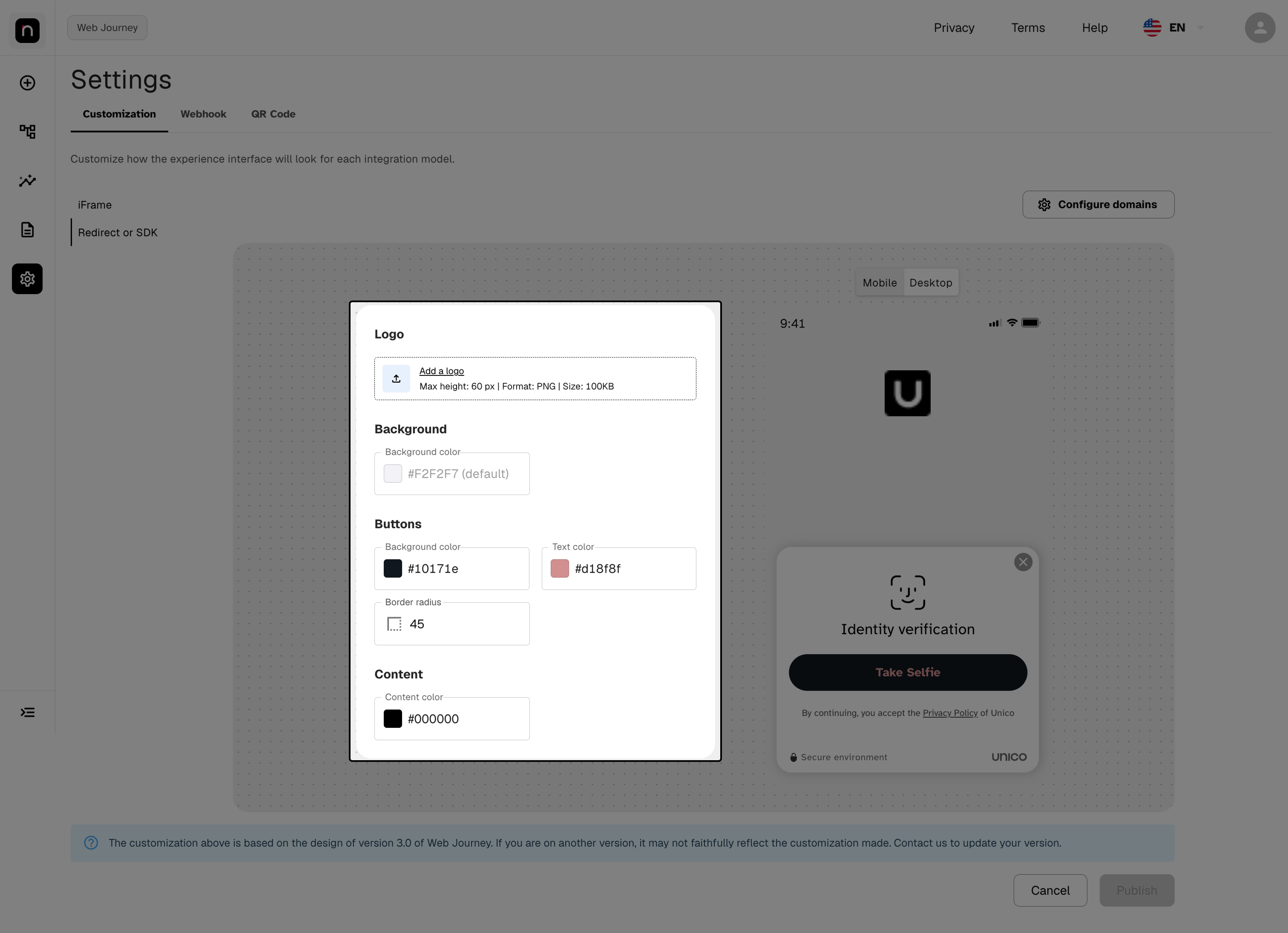
Background color, button Background/Text color, and Content color fields, with the result in the preview.
Step 5 — Configure the buttons
Three fields control the journey's action button (e.g. "Take Selfie"):
| Field | What it does |
|---|---|
| Background color | Fill color of the button |
| Text color | Color of the text inside the button |
| Border radius | Corner rounding, in pixels |
Reference values for border radius:
- 0 → rectangular button, sharp corners
- 8 to 16 → slightly rounded corners
- 24 or more → pill shape (fully rounded)
Values above half the button's height no longer change the result — the pill shape is the limit.
Use your brand's primary color for the button background. It's the element the user needs to find first — if it doesn't stand out, the journey loses conversion. And keep the border radius consistent with the rest of your product, so the journey feels like a continuation of your app rather than a third-party site.
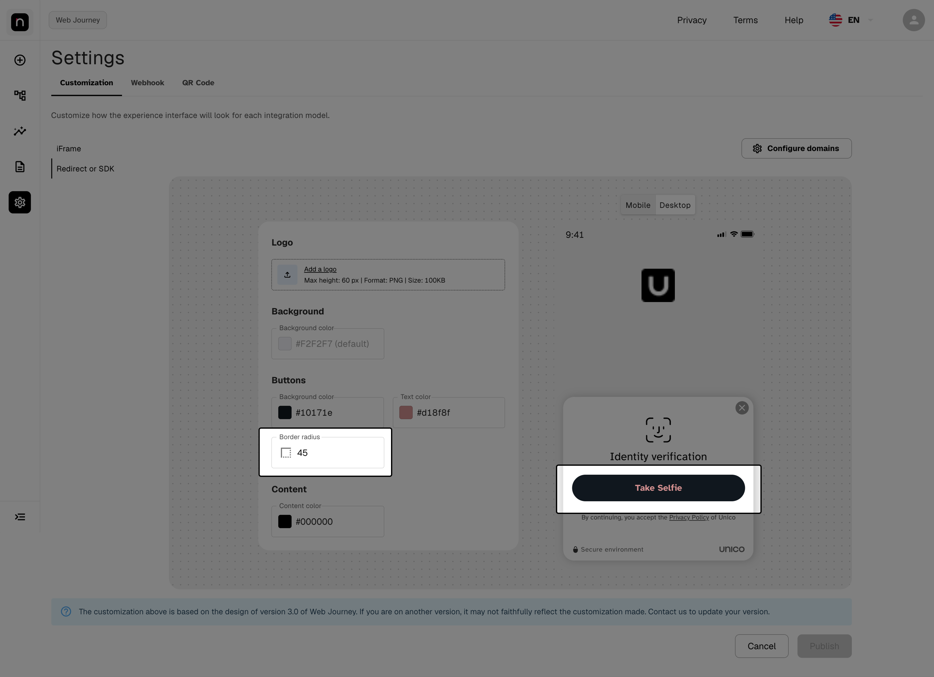
Background color, Text color, and Border radius, with the button reflected in the preview.
Step 6 — Check the preview, on mobile and desktop
The preview on the right updates on every change. Use the Mobile / Desktop selector at the top to check both formats.
If you type an invalid color value — a color name, an incomplete hex code — the field gets a red border and the value isn't applied to the preview. Fix it before continuing.
Always validate in Mobile mode. Most end users complete verification from their phone; it's the format that matters most. And check three contrasts: button text against button background, button against the journey card, and content color against the background color. It's common to configure a white button on a white card and have it simply disappear — the preview exists to reveal this before you publish.
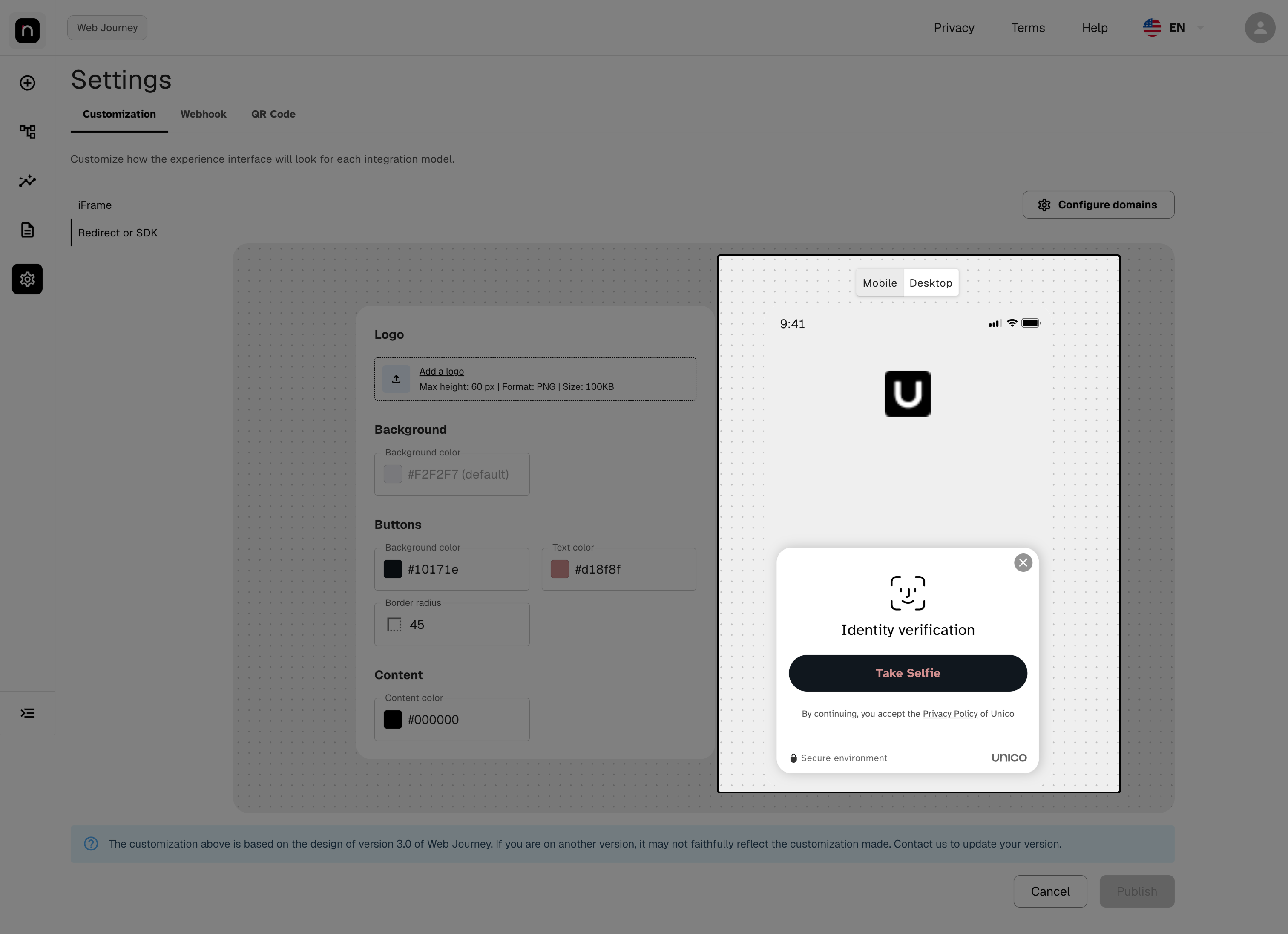
Mobile / Desktop selector and a color field with an invalid value highlighted.
Step 7 — Publish
The Publish button becomes enabled as soon as there's a pending change.
- Publish saves the configuration and applies it to the journey.
- Cancel discards everything you edited and reverts the fields to the last published state.
- To revert to the Unico default, clear the color fields (letting the placeholder reappear), remove the logo, and publish.
There's no version history. If you publish a bad configuration, the fix is to adjust the values and publish again — there's no one-click way to restore the previous version. That's why checking the preview in the previous step matters. As long as you haven't published yet, Cancel solves it.
Step 8 — Register the allowed domains
Available only in the iFrame model.
In iFrame, the journey runs embedded inside your own page. For security, only the domains registered here can load it.
-
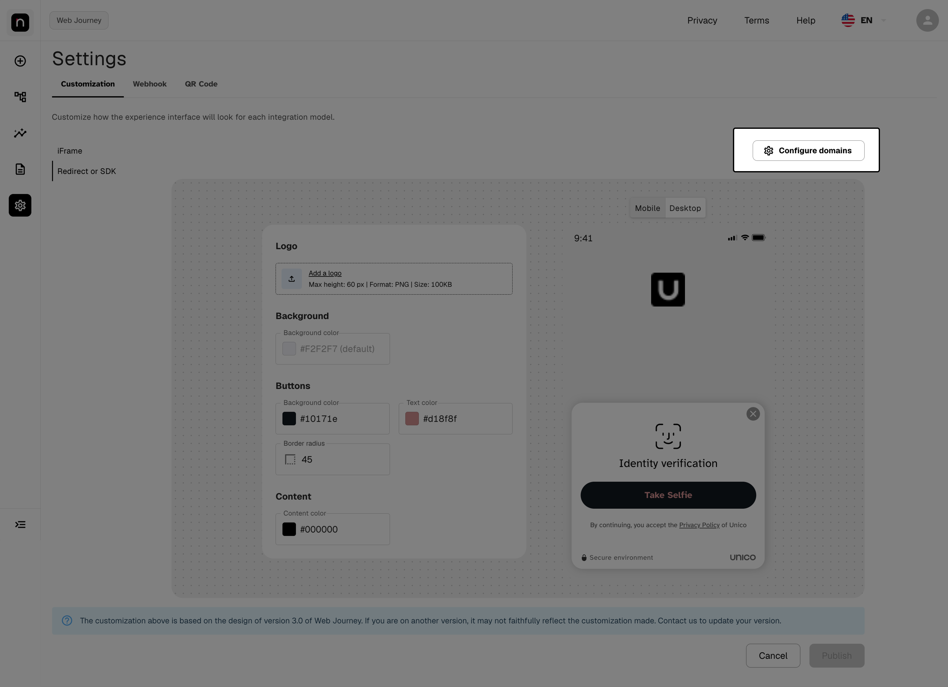
Click Configure domains, in the top-right corner.
-
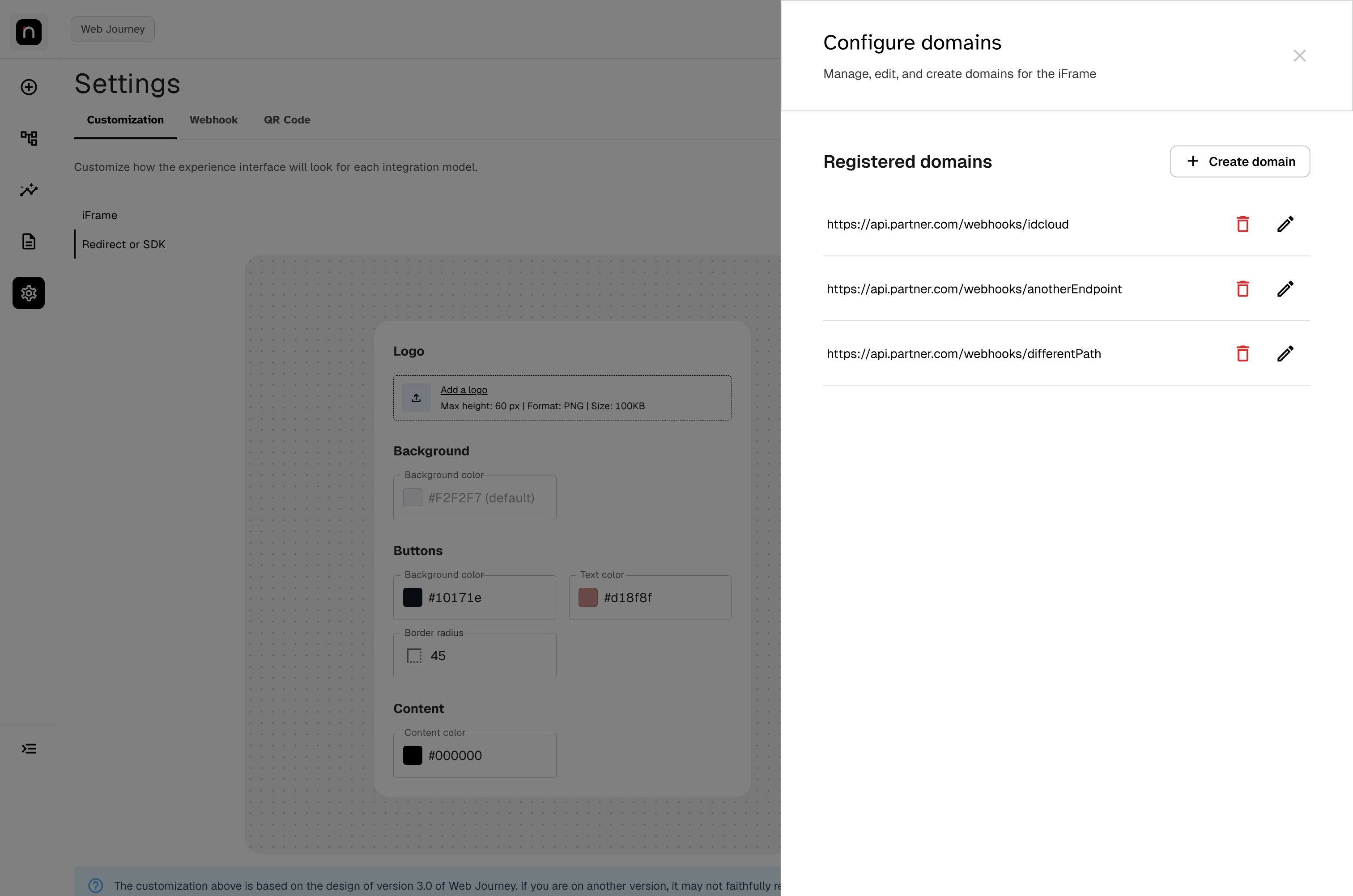
The side panel lists the Registered domains, each with edit (pencil) and delete (trash) actions.
-
To add one, click Create domain, enter the domain, and click Save.
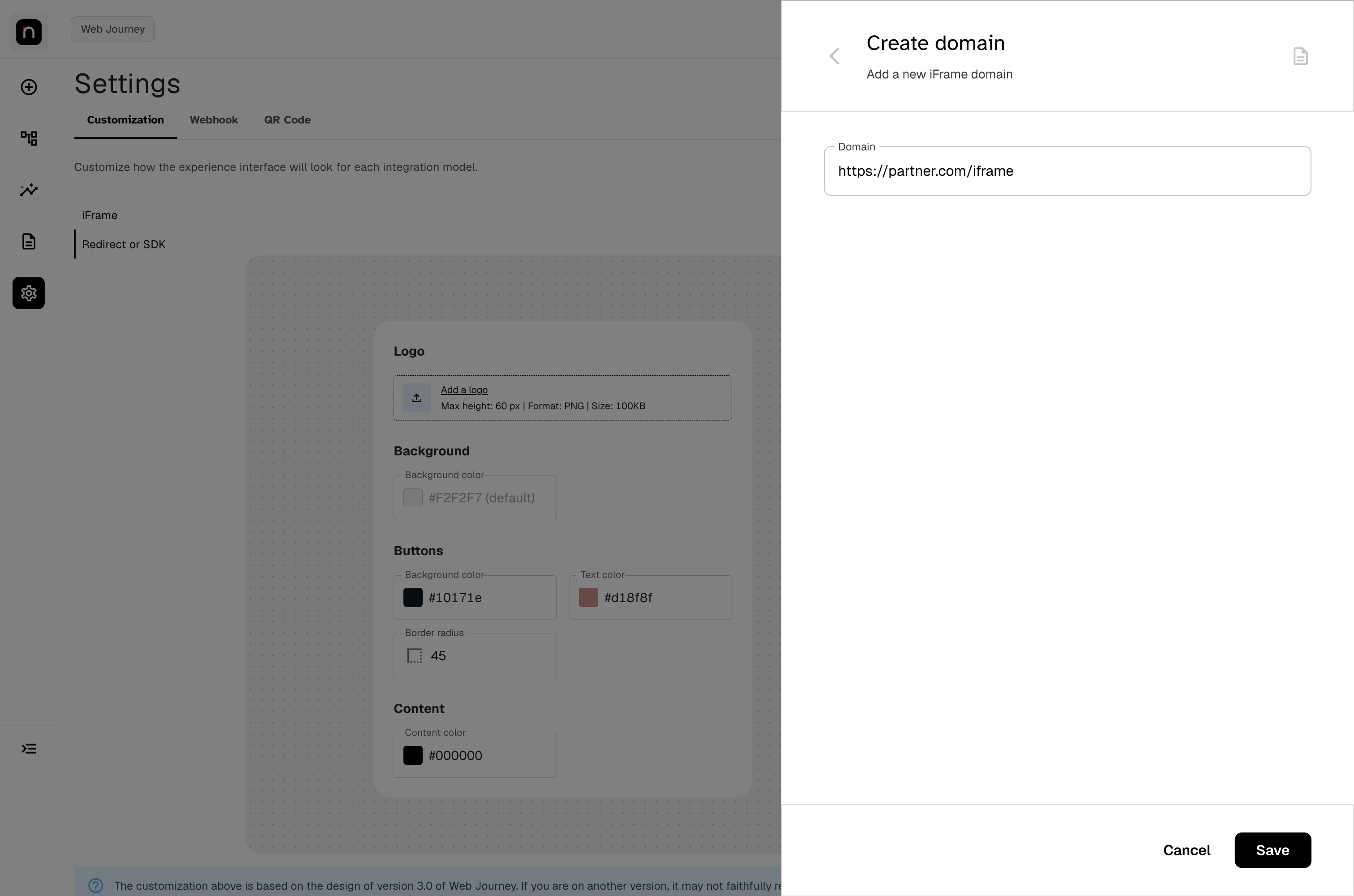
Enter the domain with its protocol (https://yoursite.com).
This list is a security setting, and it's saved separately. It's applied on the panel's own Save, not on the main screen's Publish. Also register your test and staging domains, and remove the ones no longer in use — this is the list of who can embed your journey.
FAQ
Do changes apply to journeys that are already running? No. The published configuration applies to journeys started after publishing.
Why don't I see the Logo and Background fields? Two possible causes. First: you may have iFrame selected — in iFrame the journey is embedded in your own page, which already provides the background and identity. Second: your Web Journey version may not expose the field. Background color only exists on Web Journey v3.0 in redirect, and the logo in iFrame only on Web Journey v1.0. Check the table in "Before you start".
My logo was rejected on upload. Why? Check the three requirements: PNG format, height up to 60 px, and size up to 100 KB.
The background looks too dark at the bottom of the screen. Expected — the background renders as a gradient that darkens from top to bottom. Choose a lighter base tone.
The preview doesn't match my real journey. The preview is based on the Web Journey v3.0 design. If your integration is on another version, the result may differ — contact Unico to evaluate a version update.
I published a bad configuration. How do I revert? Reopen the screen, adjust the values (or clear them to return to the default), and publish again. There's no version history. If you haven't published yet, just click Cancel.
Who changed the customization on my account? The screen doesn't show this history. To find out which user made the last change and when, contact Unico support.
Quick reference
IDCloud Portal
 └─ Settings (gear icon in the sidebar)
     └─ Customization tab
         ├─ iFrame ............... Buttons (background, text color, border radius)
         │                         Content (content color)
         │                         + Configure domains
         └─ Redirect or SDK ...... Logo (PNG, 60 px, 100 KB)
                                   Background (color, applied as a gradient)
                                   Buttons (background, text color, border radius)
                                   Content (content color)

Live preview · Mobile / Desktop · Cancel · Publish